
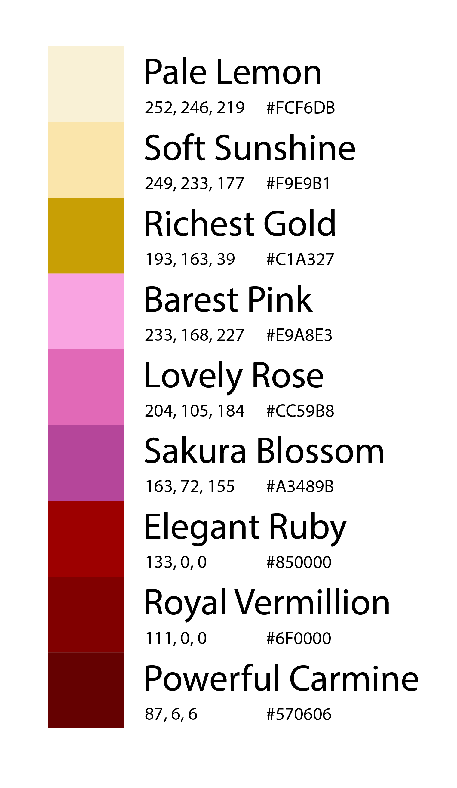
The main subject of my wallpaper collection are omamori, or Japanese protection amulets. My focus with these wallpapers laid in the color palette, with a secondary focus on composition. I wanted to fully convey the delicate omamori. Since red and gold are lucky colors in most Eastern Asian cultures, I found it important to incorporate them into my final palette. I also aspired to use pink for the sakura blossoms I incorporated into the compositions. I used reds as my primary colors, pinks as a secondary color, pale yellows as my base color, with a golden yellow for emphasis. Overall, the color palette emphasizes the rich, elegant history of omamori.
Program: Adobe Illustrator
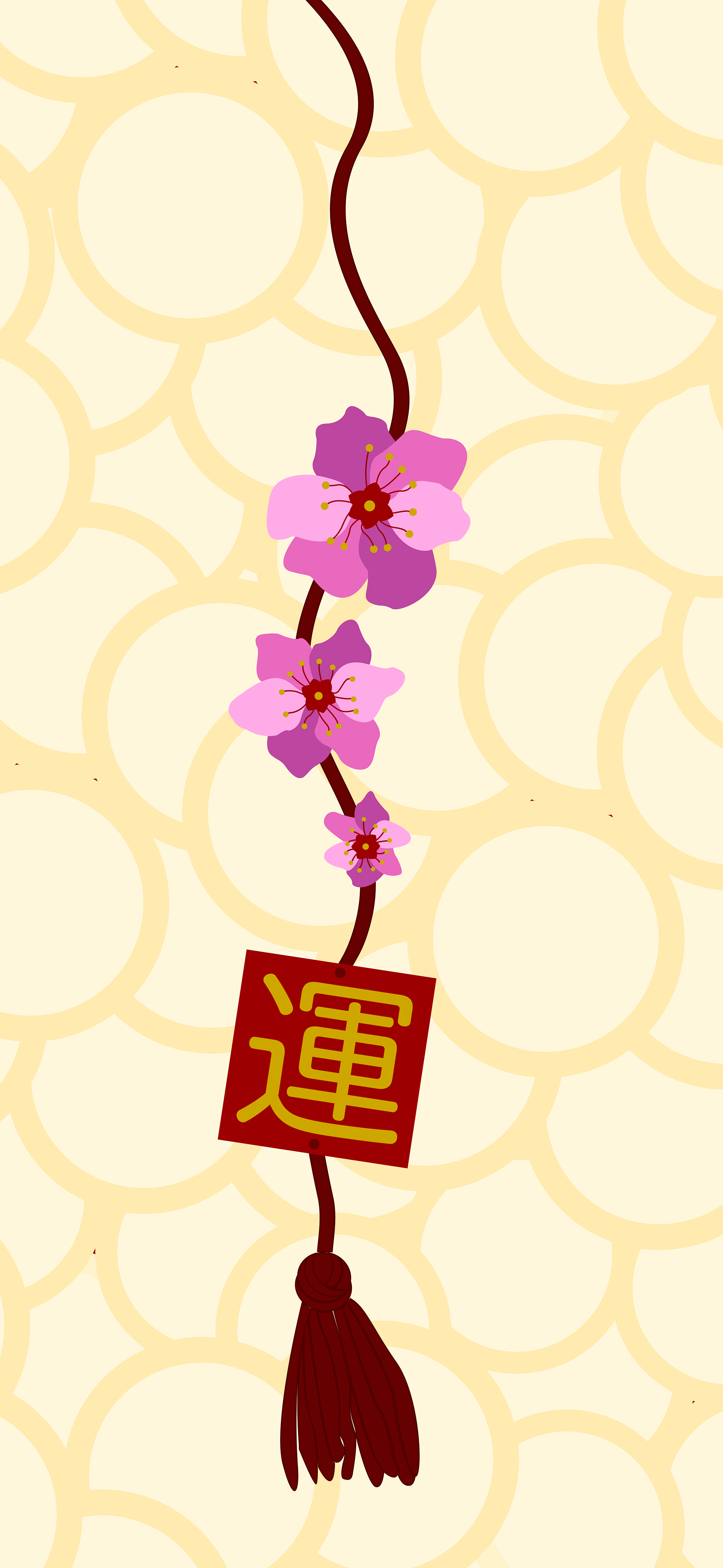

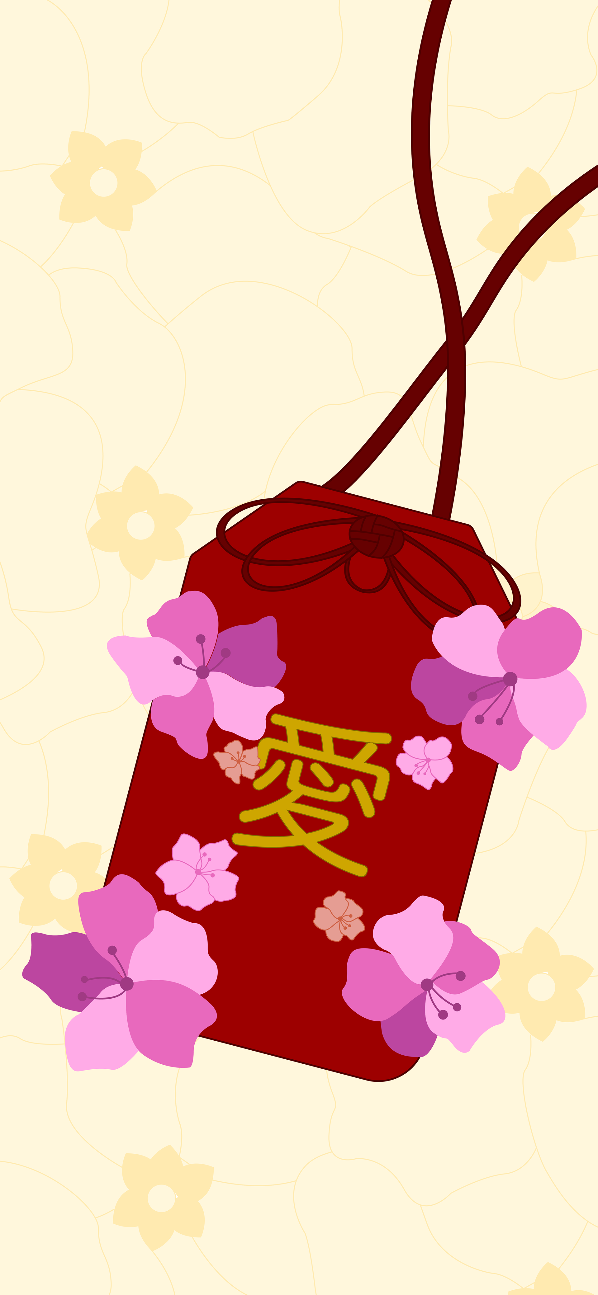
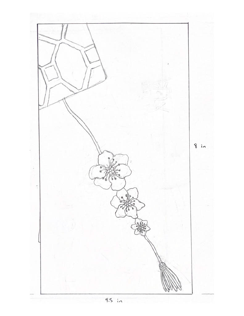
Sketches and Composition Variations
Composition 1 Sketch
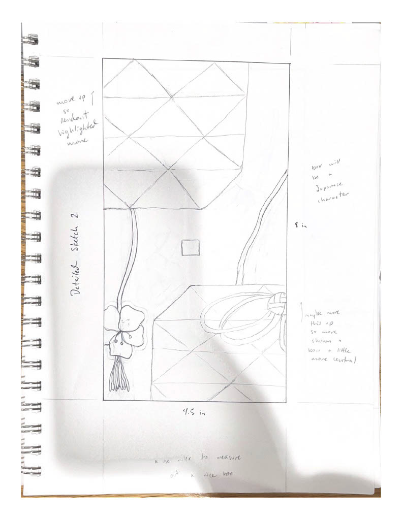
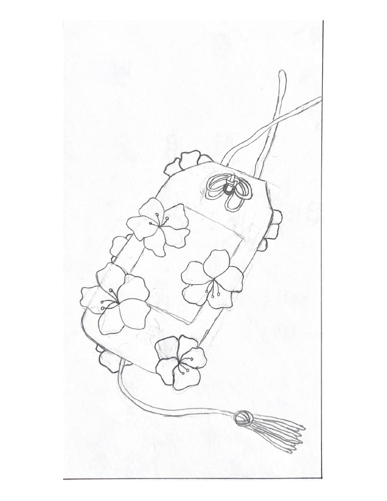
Composition 2 Sketch
Composition 3 Sketch
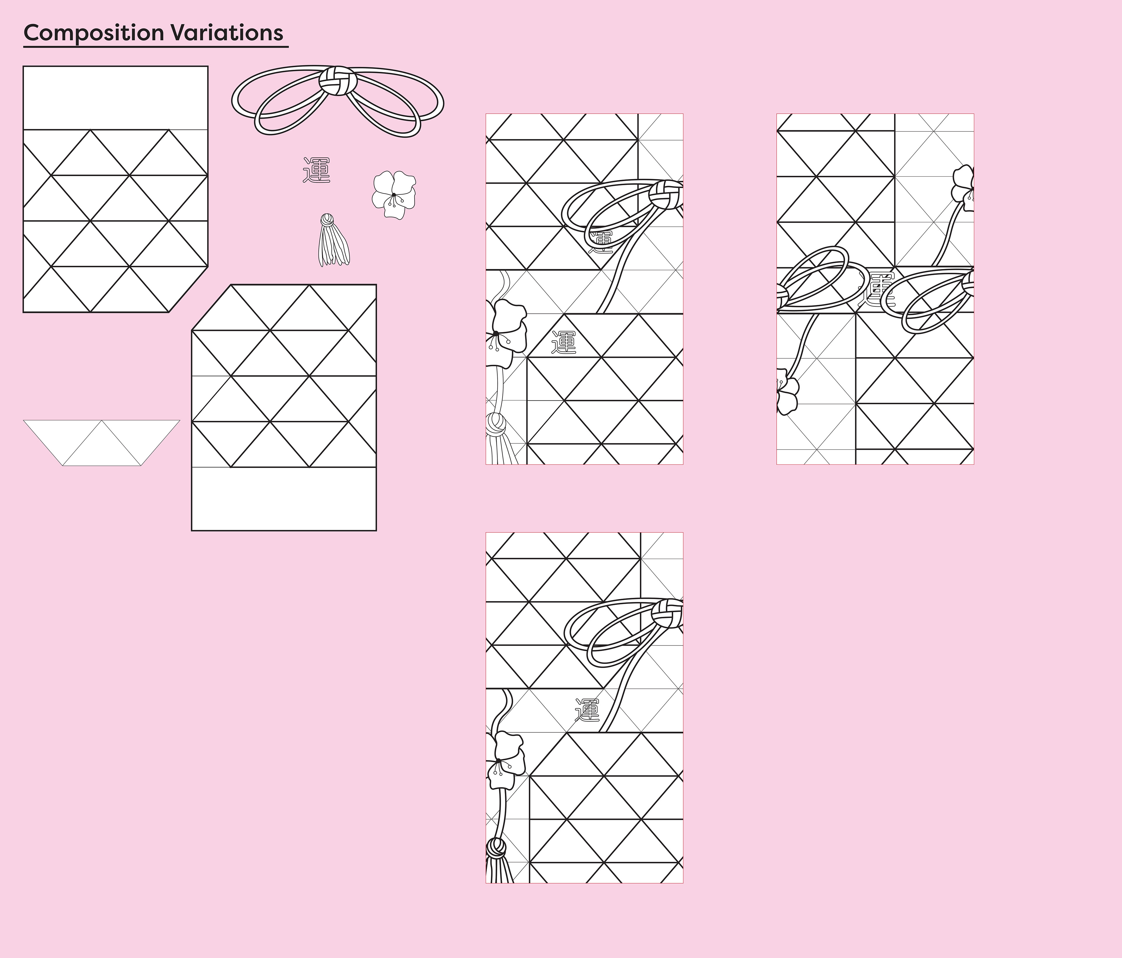
Composition 2 Variations
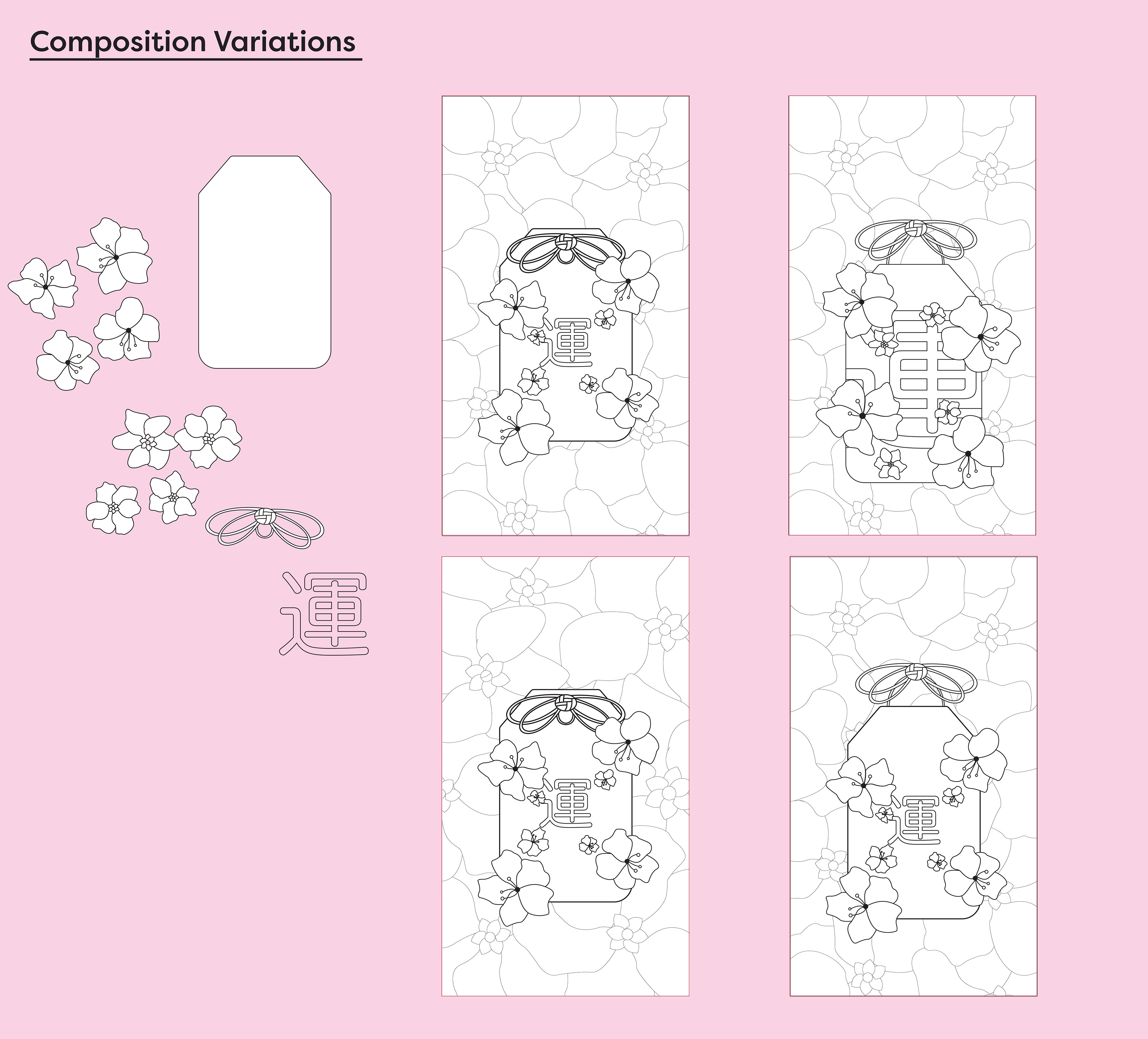
Composition 3 Variations
Color Exploration
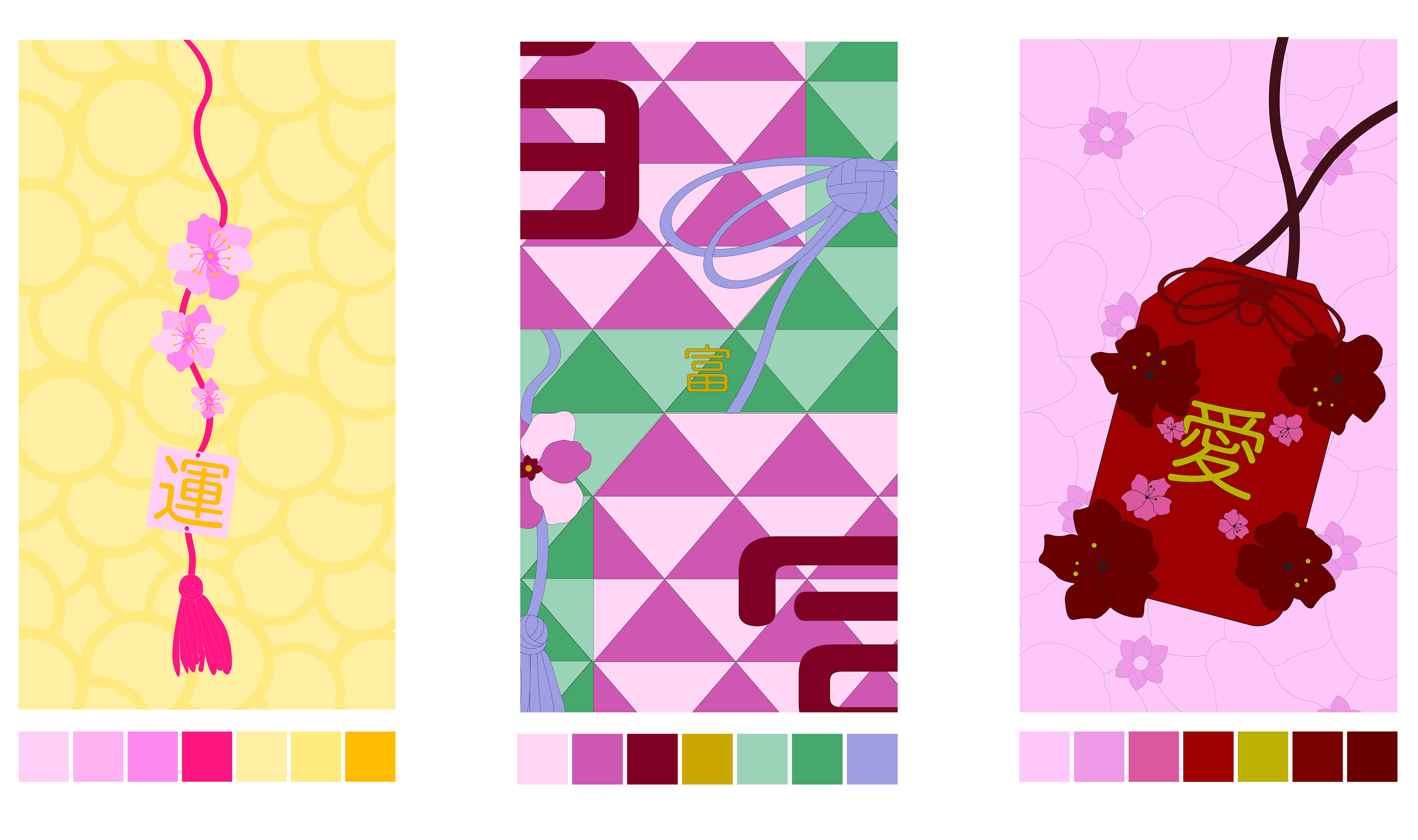
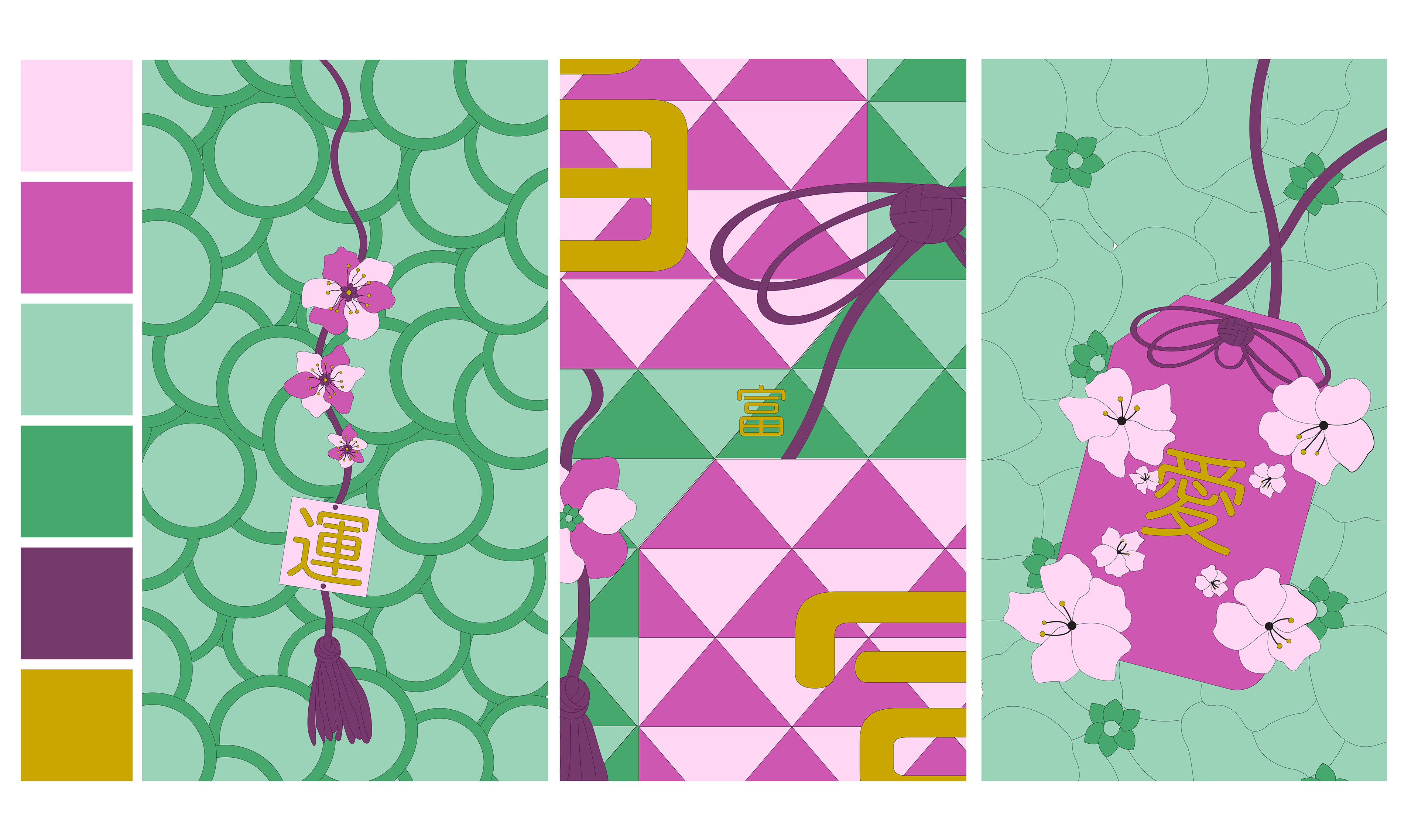
I explored over 50 color palettes for my compositions. These were two contenders for finalists, with one exploring a unique color palette for each composition, and the other utilizing colors of the Japanese dessert "dango." However, I found I like the cohesiveness of using the same color palette for each composition. Further, the red and yellow color palette creating a better sense of base and emphasis, as well as being more impactful.