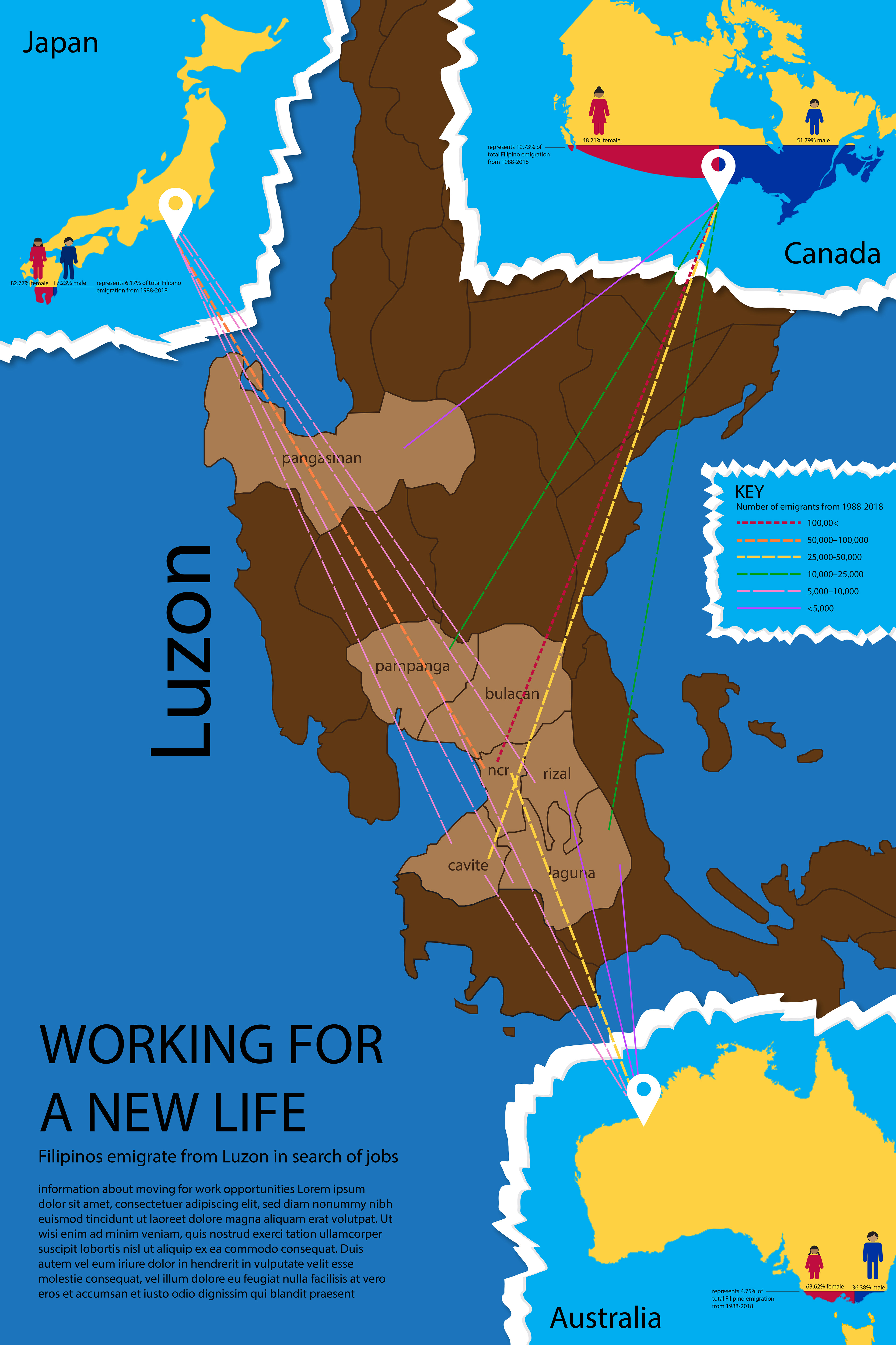
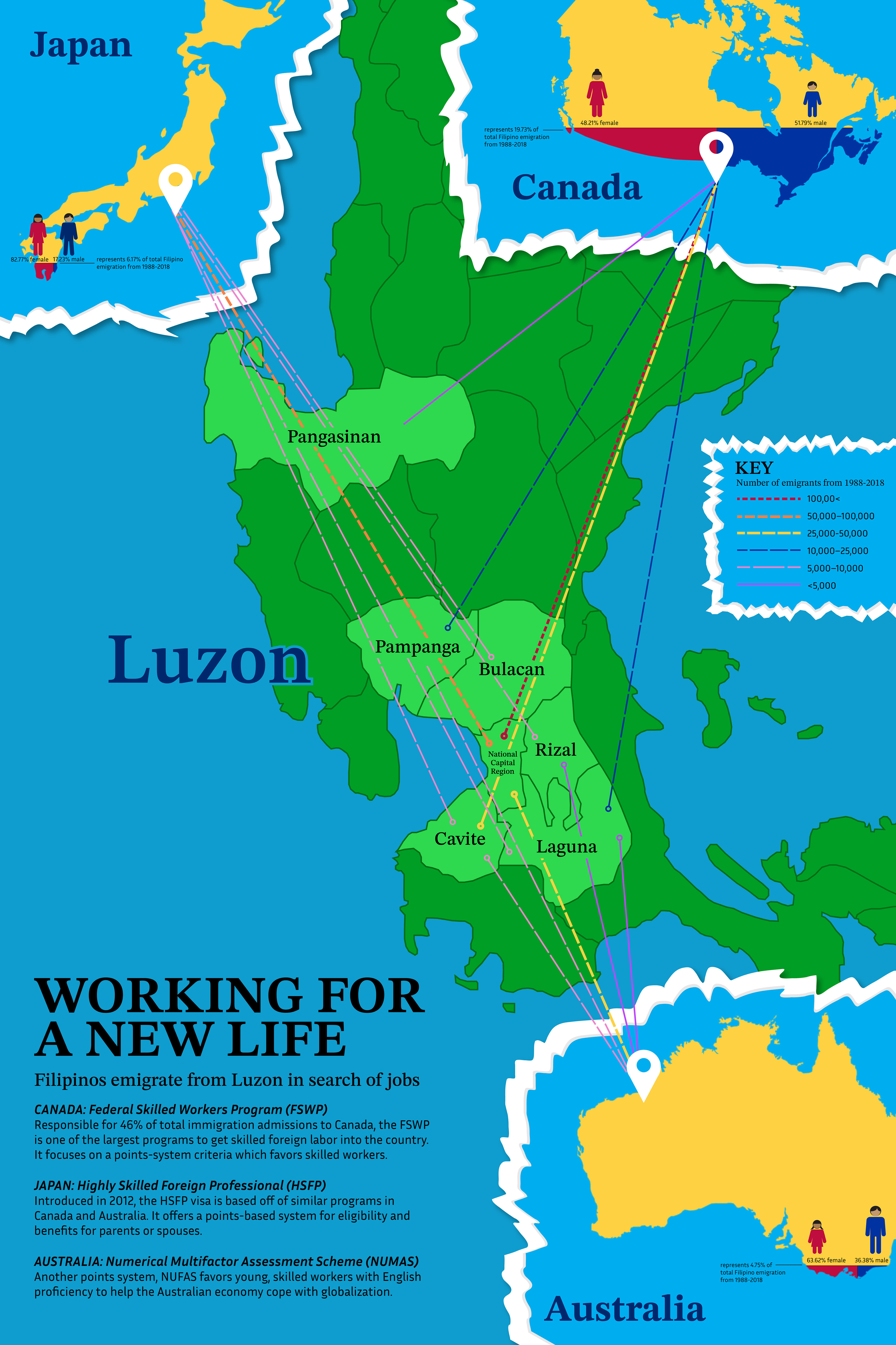
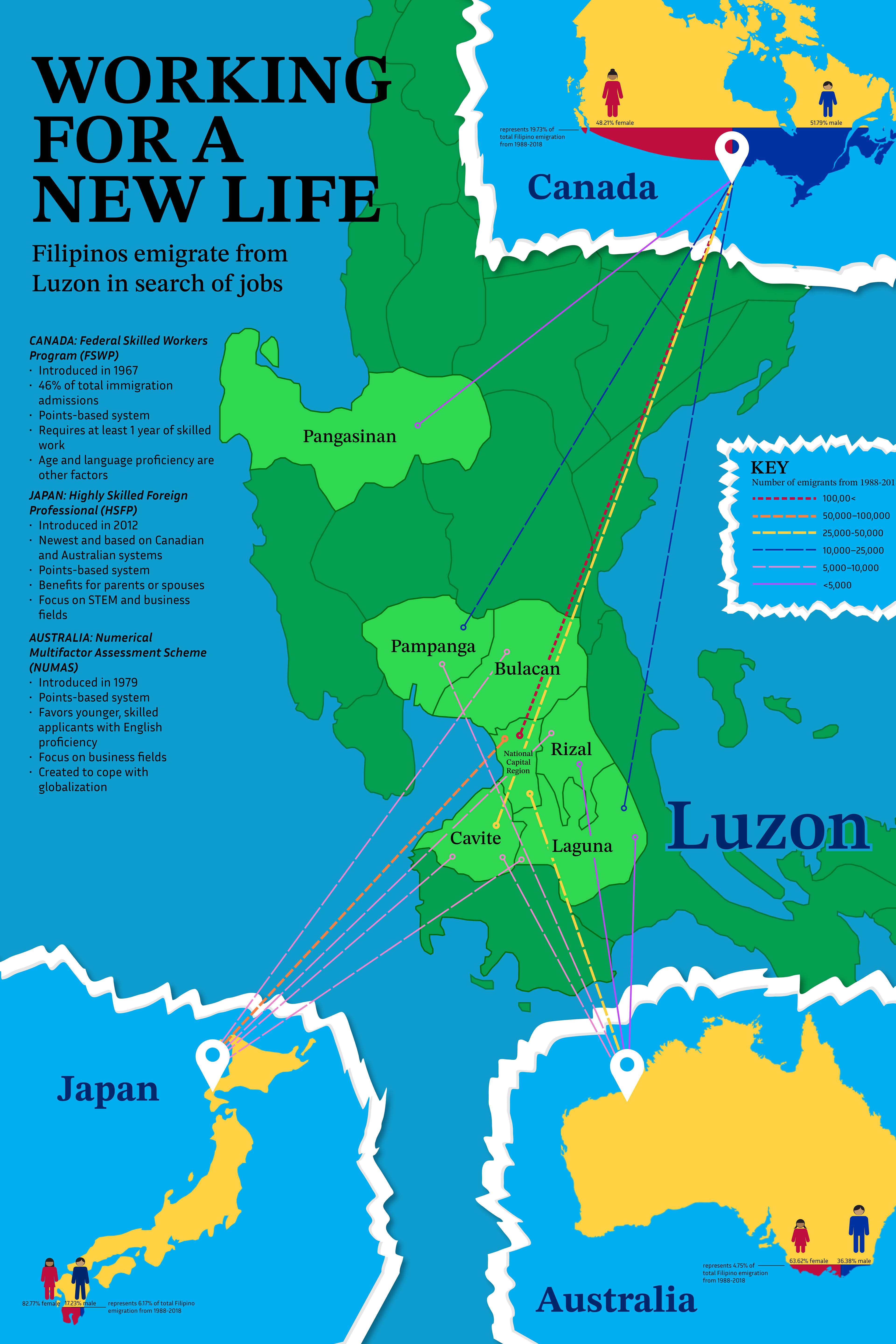
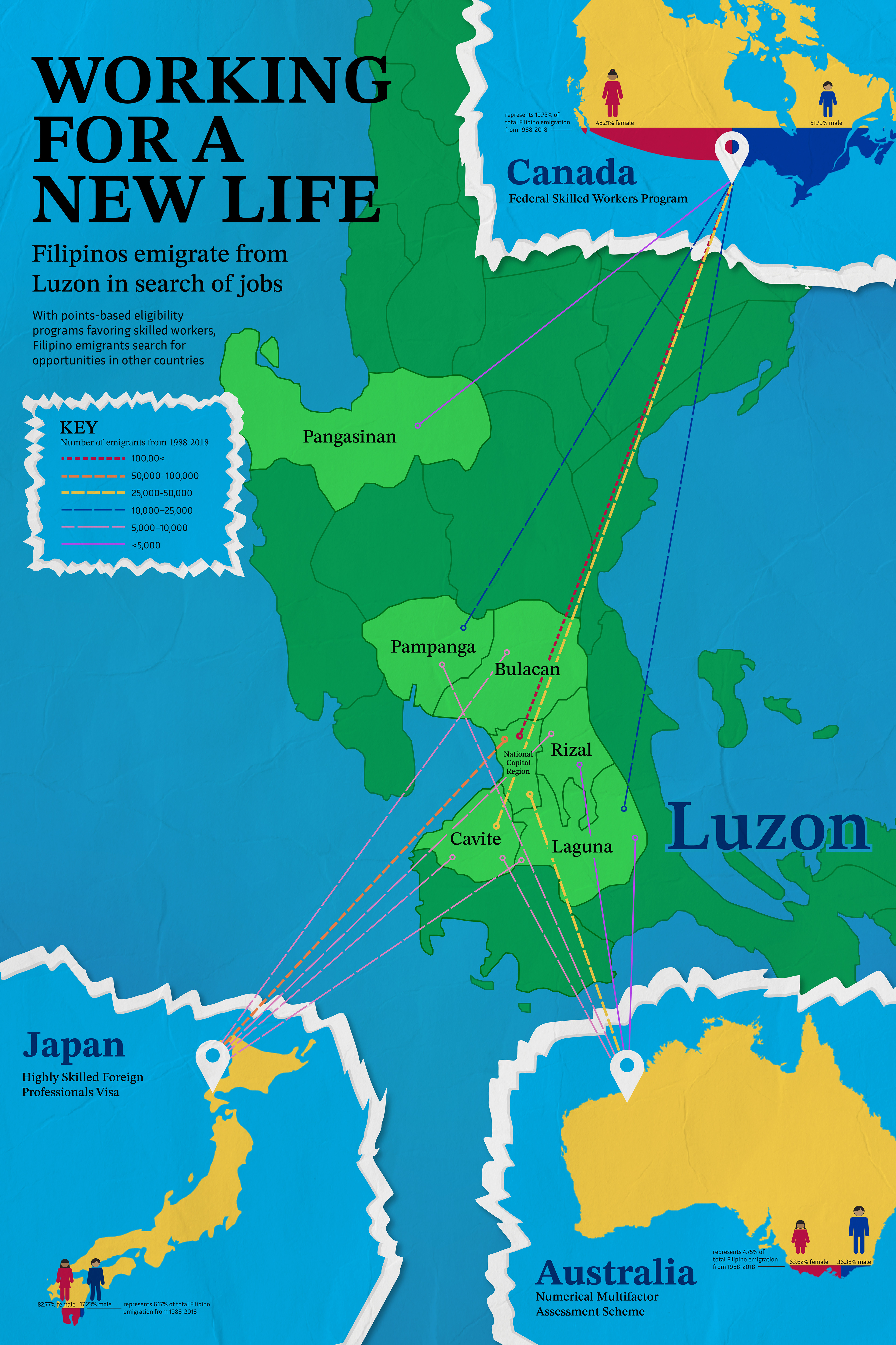
Taking data about Filipino emigration, this informational poster takes a look at what parts of the country people are moving out of, and what countries they are moving to. I hoped to replicate the style of printed maps and atlases through the use of vibrant colors.
Small details helped to make the poster cohesive. I used a torn paper edge effect for the secondary countries, furthering the image of overlapping, torn maps. My original texture was very harsh, but a more natural tear allowed me to use the effect without it being distracting. I added a wrinkled paper texture on top of the entire poster, and created an interesting title layout based off of the Philippine flag.
For the emigration information, I used both a variation in color and stroke to demonstrate how many people were leaving each province. This allowed the lines to be easily distinguishable while communicating the impact of how many people were leaving.
As this was a large poster (24x36 inches), I printed a couple tiled drafts, which allowed me to hone in on proper scaling for each element. Though the size of this poster was challenging at first, trial and error allowed me to properly execute my vision.
Program: Adobe Illustrator
Drafts & Refinements


