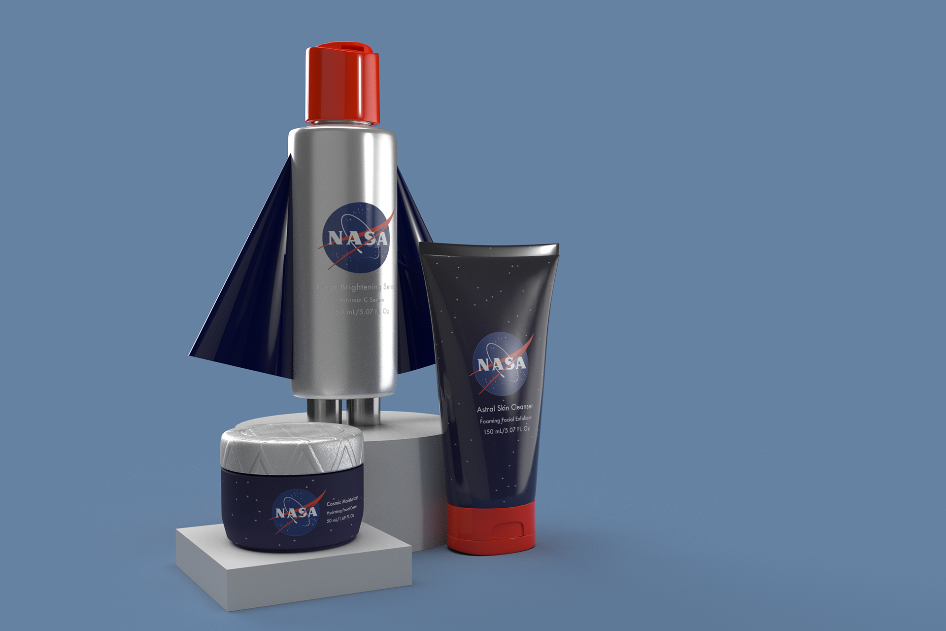
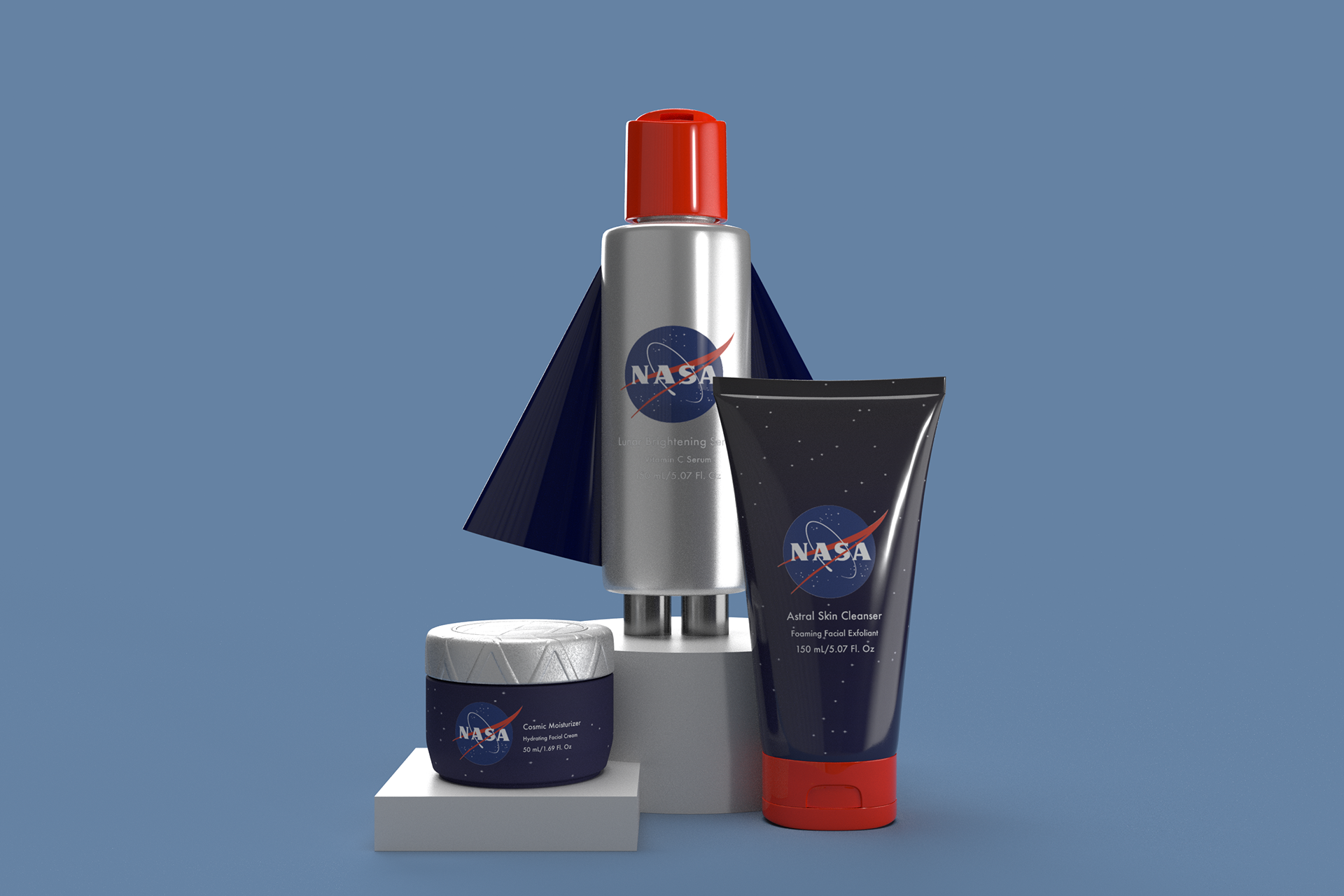
For this project, I had to create a product look for a company of my choosing. Because of my interest in space and science fiction, I decided to create skincare packaging for NASA. For this project, students also had to take an image to use as a background for one of three required renders.
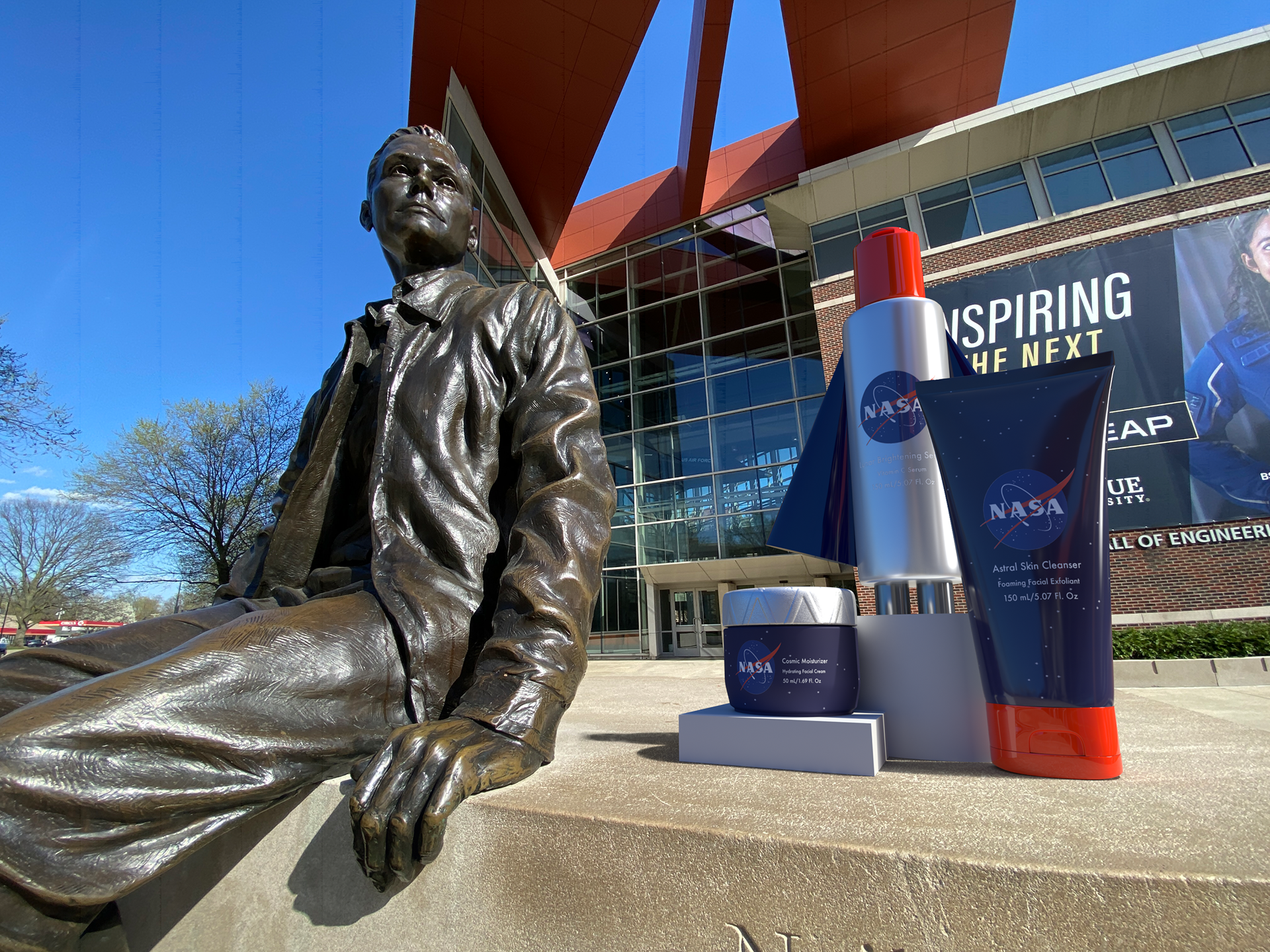
By using the silver, dark blue, and red as the color palette for the products, they are able to tie in with each other while still being unique as individual products. By combining shapes, I was able to create a rocket ship shape for the cylindrical bottle, which matches NASA well as they are a space program. Putting the starry pattern on both the squeeze bottle and the small container creates more visual interest with them, though the squeeze bottle has a shinier, plastic material while the container has a matte, rubbery plastic material. The lattice engraving on the container’s lid also creates visual interest, differentiating the metal of the lid from the metal of the cylindrical bottle.
While the background is unique compared to most skincare products’ imagery, I found it fitting for the products to be placed next to a statue of Neil Armstrong in front of the Armstrong Hall of Engineering, as he was one of the first astronauts on the moon for NASA and it almost seems as if he is endorsing the products.
Program: Adobe Dimension
Process

Sketches

Sketches (cnt'd)

Digital Process 1

Digital Process 2

